Daniel Horvath
2010
I liked to develop my logo and think of new versions.
In Hungarian we write last name, then first name. So my initials are HD.
My first logo started the trend of using my initials in my logos.
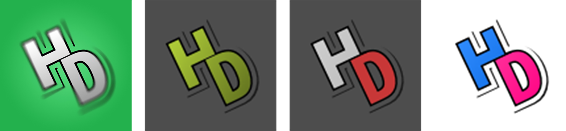
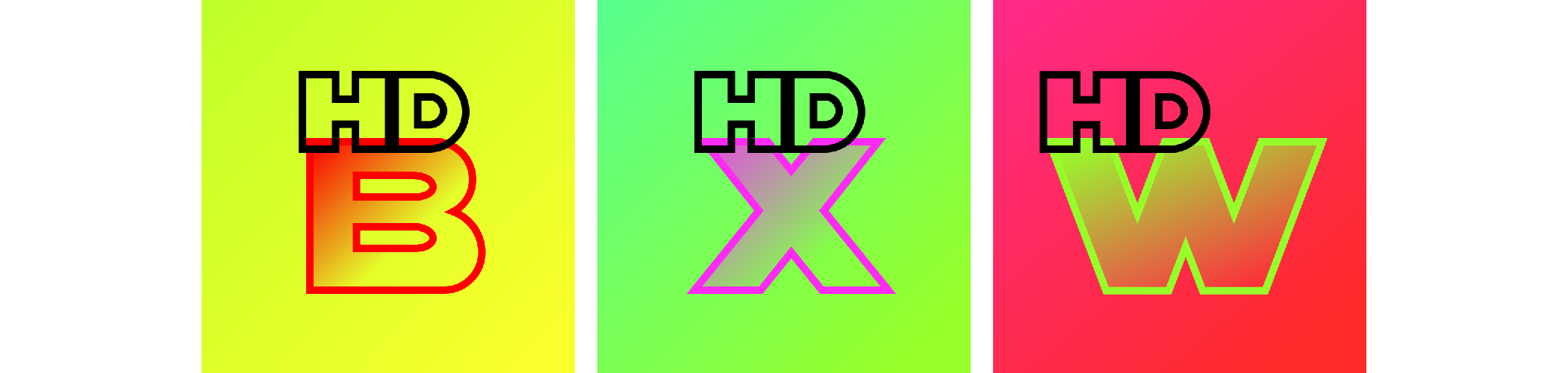
I loved making different color versions for my different web accounts.
MSN, Steam, YouTube, Flickr
2011-2013
Inspired by the logo of Linkin Park, I came up with something new.
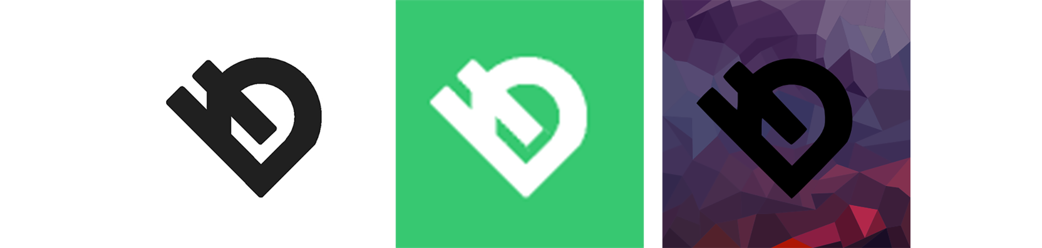
2014-2015
Architecture school inspired me to make it more abstract.
I converted the 2011 logo into flat shapes.
2015
I was fascinated by logos made out of intersecting lines.

2015
Explorations (unused)
Sometimes I experimented with other ideas.
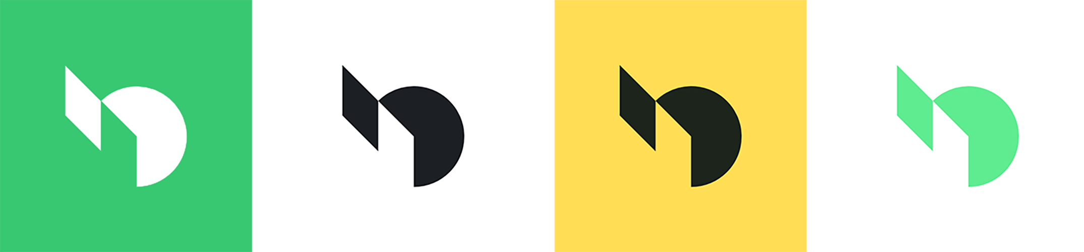
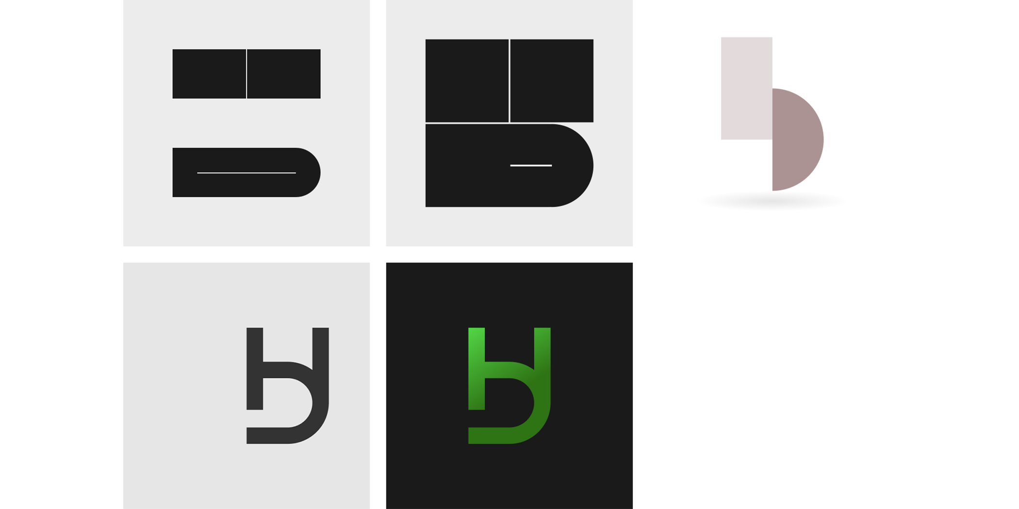
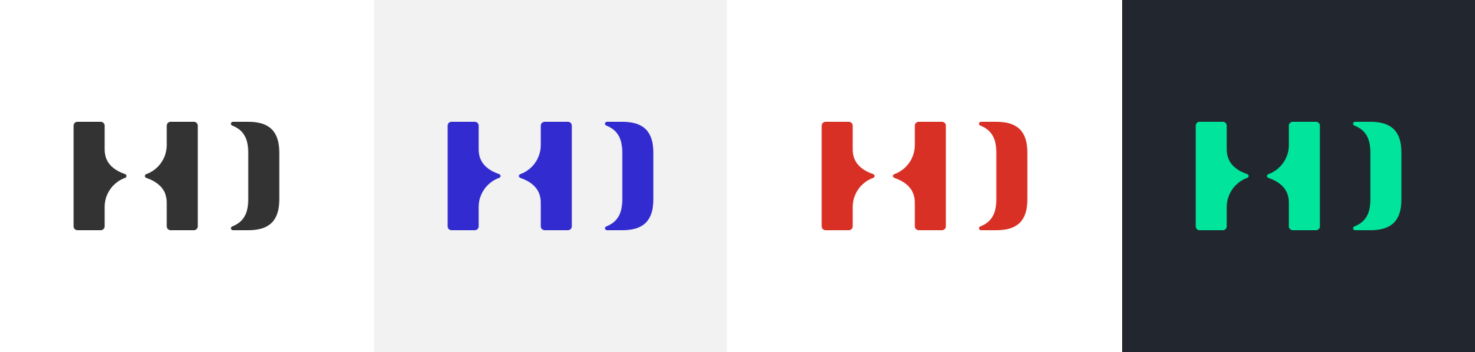
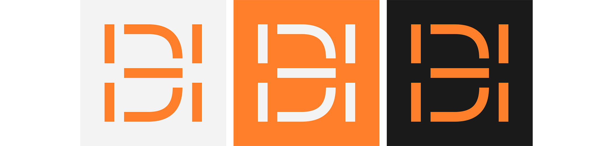
2016-2017
The foundation of the logo I used for the longest time.
Three columns, complemented by arches to form my initials.

2016
Explorations (unused)
2018-2020
Small changes to the 2016 version.
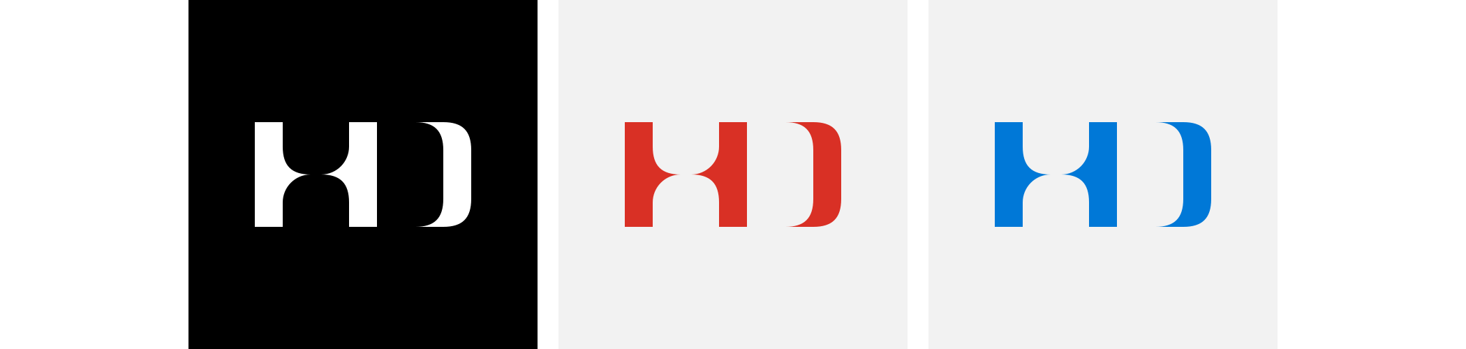
2018
Explorations (unused)

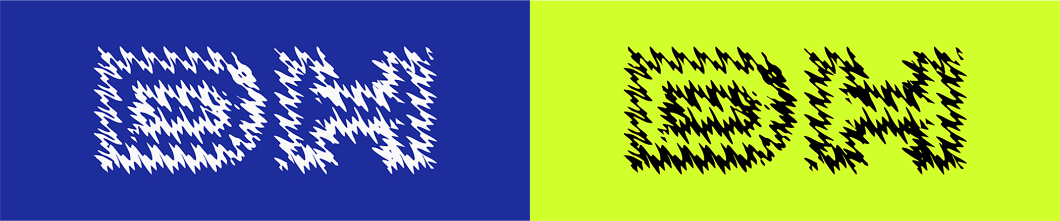
2019
Tried to make something that evokes feelings of 1990-2000's nostalgia in me.
2019
Explorations (unused)

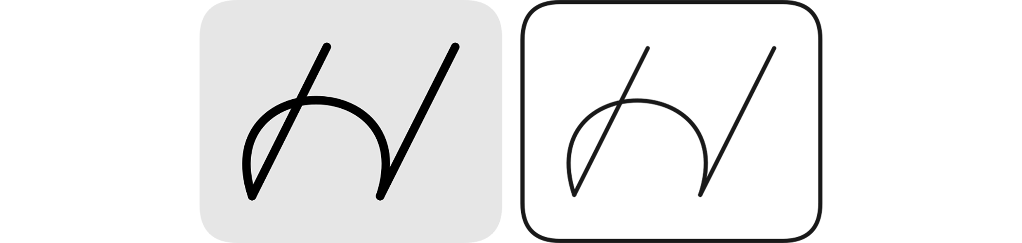
2020
Explorations (unused)
I like old cameras and their handwritten style logos.
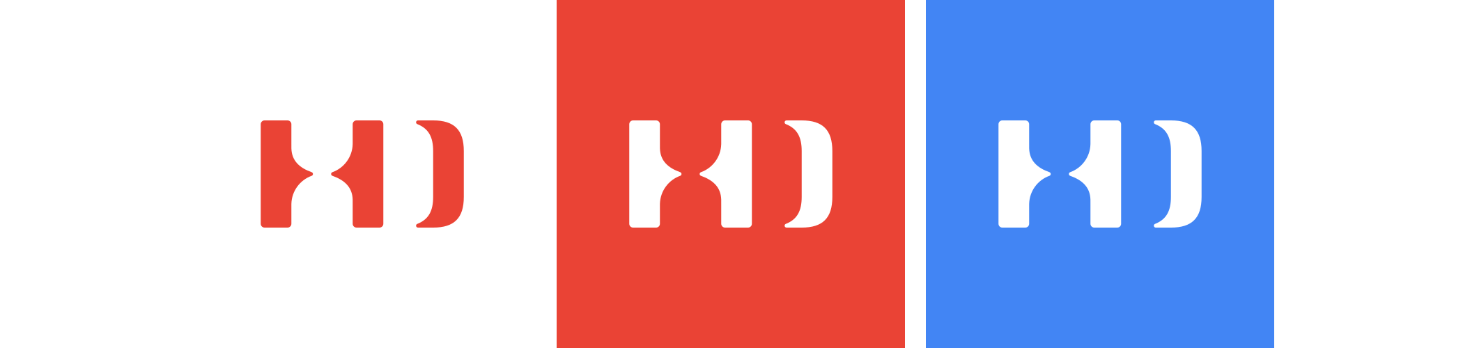
2021
Returned to my older logo.
iCloud, GMail, Microsoft, Steam
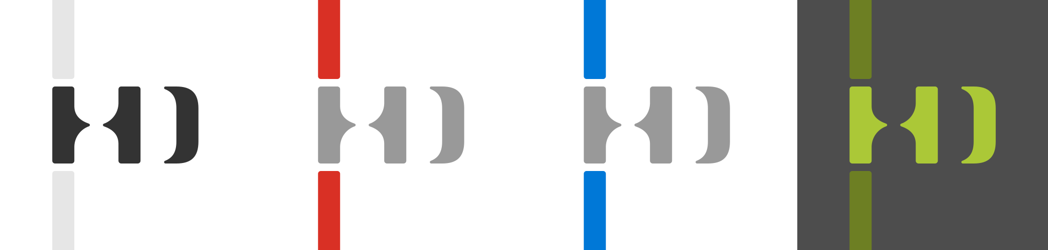
2021
General, Behance, GMail, DeviantArt
2021
Explorations (unused)
Tried to use the ⇂, 1 and ) symbols.
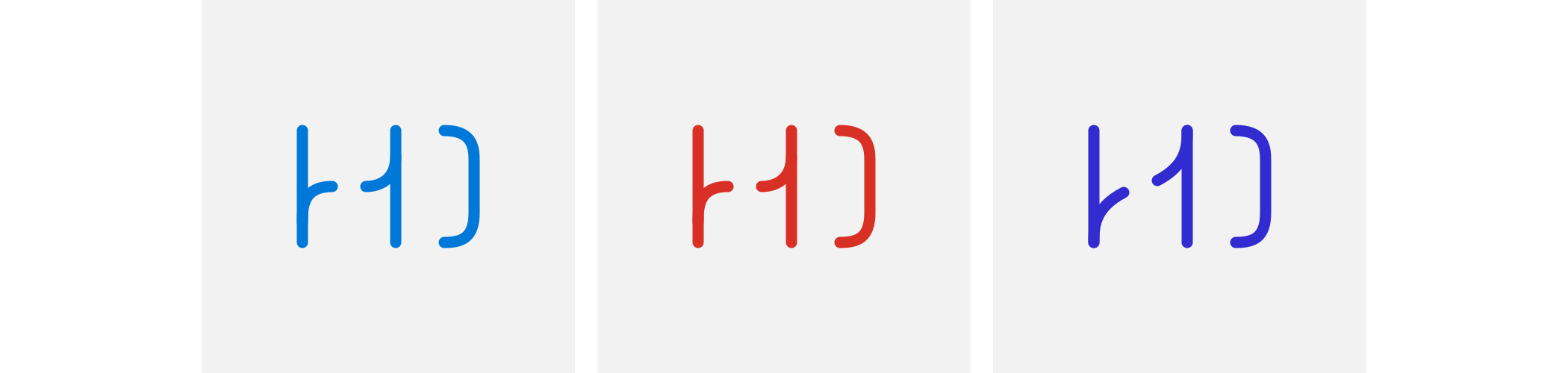
2021
Other explorations (unused)
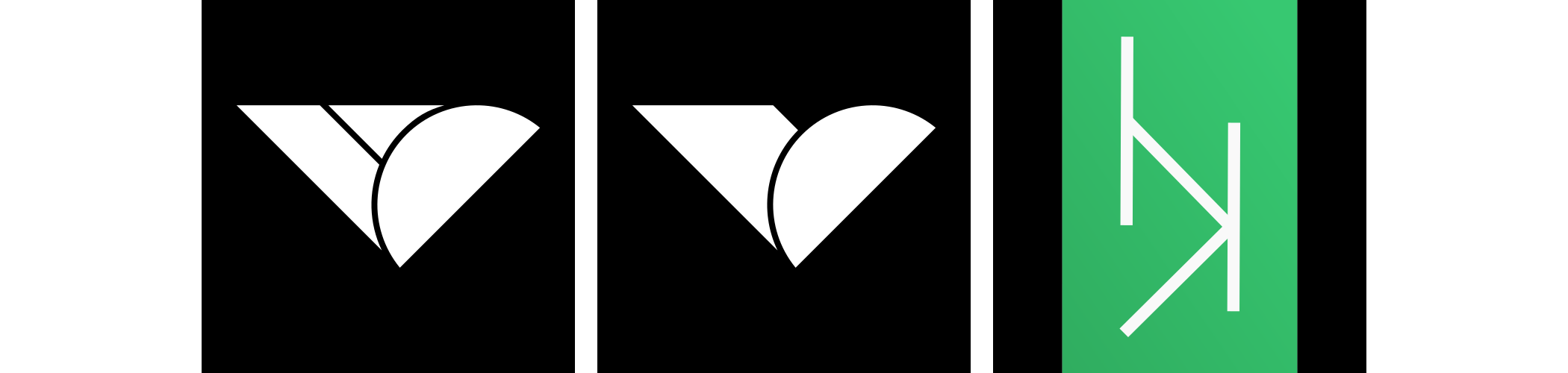
The 2016 version has always reminded me of a rotated face or mask. Tried to develop this idea into a smiley face.

2022
Changed the colors.
2023
Explorations for different accounts (unused)
2023
I wanted to move away from Hungarian initials, but wasn't sure about hiding the letter D altogether. I tried to hint at it with a curved H.

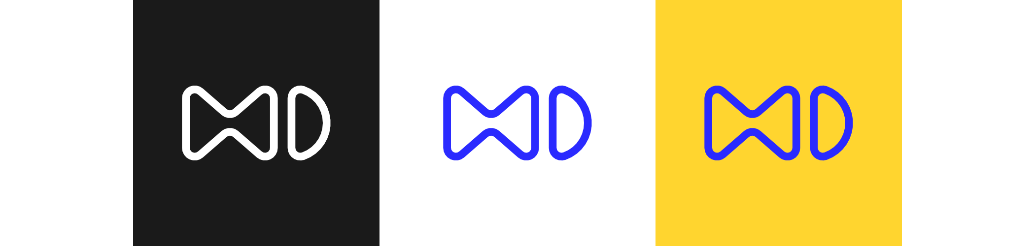
2024
If the initials are inside each other, the order doesn't matter. I no longer had to hide any of the letters.
2025
Explorations (unused)
2025
I wanted something more abstract. H and D on each other, then converted to columns. This felt like the correct succession of the 2016 version.

© Daniel Bendeguz Horvath